This article was scraped from Rochester Subway. This is a blog about Rochester history and urbanism has not been published since 2017. The current owners are now publishing link spam which made me want to preserve this history.. The original article was published May 21, 2012 and can be found here.
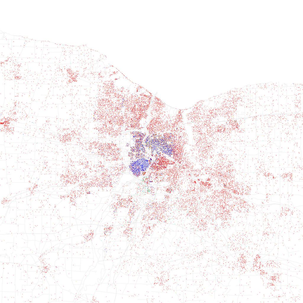
![This is a map of racial and ethnic populations (and divisions) in Rochester. It was created by Eric Fischer using 2010 Census data. Inspired by Bill Rankin's 2009 map of Chicago. [FLICKr: Eric Fischer]](https://www.rochestersubway.com/images/photos/rochester-ethnicity-map.jpg?ref=senseofplace.dev)
When I saw this image of Rochester I was immediately struck. Pointillism is a style of painting in which small, distinct dots of pure color are applied in patterns to form an image. Think of works by masters such as Van Gogh or Georges Seurat like A Sunday Afternoon on the Island of La Grande Jatt

. From a distance we see one thing. Upon closer inspection we may see something entirely different...
![A closeup of downtown Rochester. Notice the distinct quadrants. Red = Caucasians, Blue = African American, Green = Asian, Orange = Hispanic/Latino, Yellow = Other. Each dot represents 25 residents. [FLICKr: Eric Fischer]](https://www.rochestersubway.com/images/photos/rochester-ethnicity-map-zoom.gif?ref=senseofplace.dev)
This map of race and ethnicity in Rochester was created by Eric Fischer using 2010 Census data ( take a closer look
). He's created one for just about every metro area in the United States
. Red dots are Caucasians, blue dots are African Americans, green are Asians, orange are Hispanic/Latinos and yellow is "other" -- each dot equals 25 residents. The technique was inspired by Bill Rankin's 2009 map of Chicago
. I'll let him explain in the following Youtube video...
What I love about this map is that it draws attention to both the stark fragmentation of race across our region, and at the same time, if you look closely it becomes impossible to draw a line around any one group of people. Typical neighborhood maps draw solid lines around communities. Those lines contribute to further segregation by allowing us to form artificial territorial distinctions in our minds. But look closely at the heavily blue 19th Ward or the red South Wedge. You'll notice that things are not as "black and white" as they appear. Of course, the river and I-490 pose very real physical boundaries. But there are some interesting things happening in many areas of this map where one neighborhood weaves itself into the next. Some beautiful things.
Finally, below are some other cities I found interesting. There's probably much more to learn about our own "dot" map by holding it up against these other places. Enjoy...
Buffalo

New York City

Los Angeles

Miami

Boston

Philadelphia

Portland, Oregon

This post comes just after the U.S. Census reported that whites account for under half of births in the U.S.
And a fact pointed out locally by Rachel Barnhart last week
, in Monroe County, whites make up 72 percent of the population... but 56 percent of children under 5 are white.