This article was scraped from Rochester Subway. This is a blog about Rochester history and urbanism has not been published since 2017. The current owners are now publishing link spam which made me want to preserve this history.. The original article was published July 01, 2014 and can be found here.
![The High Falls Business Association has been repainting some of the old 'ghost' advertising signs on buildings along Mill Street. [PHOTO: RochesterSubway.com]](https://senseofplace.dev/content/images/photos/rochester-high-falls-ghost-advertising-signs-repainted-03.jpg)
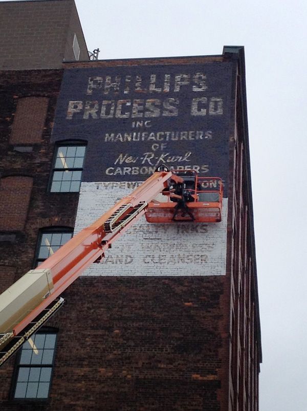
You know those faded advertisements on the sides of old brick buildings? You may have heard them referred to as ghost signs because they're usually just barely there, hanging on like spirits of a bygone era. Yeah, I love those things. Probably because they combine my two favorite hobbies: graphic design and local history.
The building I work in (in the High Falls neighborhood) has one of these signs on it. So naturally I took notice when someone began painting over it...
![The High Falls Business Association has been repainting some of the old 'ghost' advertising signs on buildings along Mill Street. [PHOTO: RochesterSubway.com]](https://senseofplace.dev/content/images/photos/rochester-high-falls-ghost-advertising-signs-repainted-02.jpg)
It turns out the High Falls Business Improvement District hired an artist to repaint two of these signs, one on the Partners Building and the other on the Parazin Building . The same artist was also commissioned to paint the High Falls historic district logo on another building at the corner of Platt and Mill Street.
![The High Falls Business Association has been repainting some of the old 'ghost' advertising signs on buildings along Mill Street. [PHOTO: RochesterSubway.com]](https://senseofplace.dev/content/images/photos/rochester-high-falls-ghost-advertising-signs-repainted-04.jpg)
John August, president of the Improvement District tells me the project is part of an effort to give the neighborhood back a piece of its identity. "When RG&E demolished the [Beebee Station] smokestacks, we lost our beacon in the night," referring to the High Falls logo that was painted atop one of those stacks

. "We have a pot of money for special projects, and so this has been in the works for a few years."
![The High Falls Business Association has been repainting some of the old 'ghost' advertising signs on buildings along Mill Street. [PHOTO: RochesterSubway.com]](https://senseofplace.dev/content/images/photos/rochester-high-falls-ghost-advertising-signs-repainted-05.jpg)
August says the project will cost roughly $25,000. That includes the installation of new light to illuminate the High Falls sign at night.
![The High Falls Business Association has been repainting some of the old 'ghost' advertising signs on buildings along Mill Street. [PHOTO: RochesterSubway.com]](https://senseofplace.dev/content/images/photos/rochester-high-falls-ghost-advertising-signs-repainted-06.jpg)
Local artist/muralist, Brett Steeves

was selected to do the work which wrapped up this past Friday.
![The High Falls Business Association has been repainting some of the old 'ghost' advertising signs on buildings along Mill Street. [PHOTO: RochesterSubway.com]](https://senseofplace.dev/content/images/photos/rochester-high-falls-ghost-advertising-signs-repainted-07.jpg)

offer us a look at what were the design & typographic styles of the time. They also remind us of the people who used to work here and what it was they did. These signs give great character and visual interest to our urban spaces. And let's face it, we just don't make 'em like that anymore. These are really one of a kind pieces of art.
![The High Falls Business Association has been repainting some of the old 'ghost' advertising signs on buildings along Mill Street. [PHOTO: RochesterSubway.com]](https://senseofplace.dev/content/images/photos/rochester-high-falls-ghost-advertising-signs-repainted-08.jpg)
As with any historic artifact, conservationists (myself included) may cringe upon reading this article. Personally, I love the new mural of the High Falls emblem, but I'm less enamored with the repainting of the older signs. Even though they are now spiffed up and much easier to see, I think somehow a bit of the historic element has been covered over; their mystique washed away. Perhaps that's just me.
![The High Falls Business Association has been repainting some of the old 'ghost' advertising signs on buildings along Mill Street. [PHOTO: RochesterSubway.com]](https://senseofplace.dev/content/images/photos/rochester-high-falls-ghost-advertising-signs-repainted-09.jpg)
![The High Falls Business Association has been repainting some of the old 'ghost' advertising signs on buildings along Mill Street. The High Falls waterwheel logo is a new addition. [PHOTO: RochesterSubway.com]](https://senseofplace.dev/content/images/photos/rochester-high-falls-ghost-advertising-signs-repainted-10.jpg)
![The High Falls Business Association has been repainting some of the old 'ghost' advertising signs on buildings along Mill Street. The High Falls waterwheel logo is a new addition. [PHOTO: RochesterSubway.com]](https://senseofplace.dev/content/images/photos/rochester-high-falls-ghost-advertising-signs-repainted-11.jpg)
It is worth noting that all of these buildings are within the High Falls preservation district. But oddly enough, Rochester's preservation board was only required to give approval for the new "High Falls" sign, and not the repainting of the old ones.
![The High Falls Business Association has been repainting some of the old 'ghost' advertising signs on buildings along Mill Street. The High Falls waterwheel logo is a new addition. [PHOTO: RochesterSubway.com]](https://senseofplace.dev/content/images/photos/rochester-high-falls-ghost-advertising-signs-repainted-12.jpg)
All in all, I applaud the effort.


