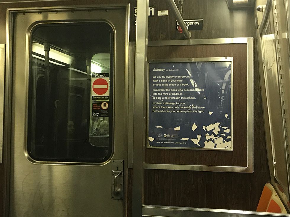
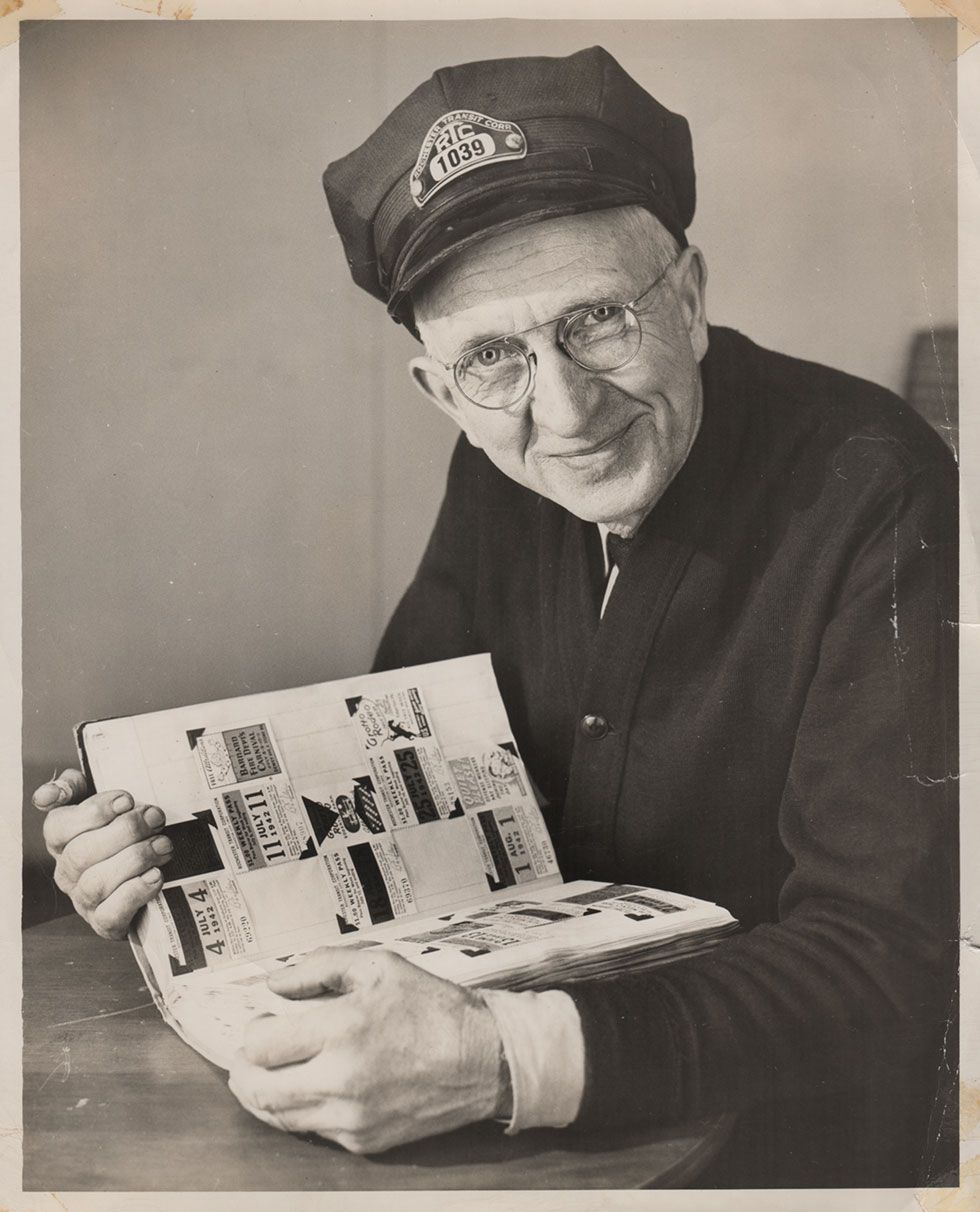
This article was scraped from Rochester Subway. This is a blog about Rochester history and urbanism has not been published since 2017. The current owners are now publishing link spam which made me want to preserve this history.. The original article was published April 25, 2011 and can be found here.
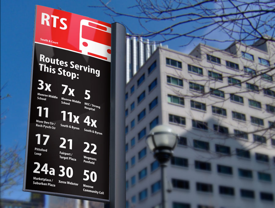
While visiting Seattle a few years ago something occurred to me. Here I was on the other side of the country in a city I had never been to before in my life, and I was navigating their bus system like seasoned Seattleite. There were no fancy digital real-time signs, I had no smart phone, no GPS anything... I didn't even have a printed schedule. I didn't need any of those things because I had this...
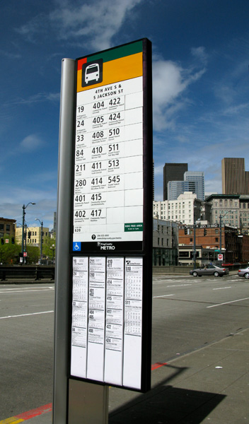
A well-designed sign.
How can one sign improve the way an entire transit system is used? Let me give you an example.
Before 1966 when the New York City Transit Authority (NYCTA) finally enlisted the help of Massimo Vignelli and Unimark Design Consultants to design the subway's signage, the subway system was in a sorry state. Station signs were small and difficult to read from a distance. Random colors and styles were used. Directional signs were often slapped together by subway maintenance workers as they were needed. And new signs were constantly being added to clear up confusion caused by other bad signs. This only caused more confusion. Rider frustrations were high and ridership was low.
This problem may never have been addressed by NYCTA if it were not for a typographic designer named George Salomon. In 1957 Salomon made an unsolicited proposal to the NYCTA entitled "Out of the Labyrinth: A plea and a plan for improved passenger information in the New York subways." In his proposal Salomon made many suggestions such as color coding the trains and standardizing typography on all signage.
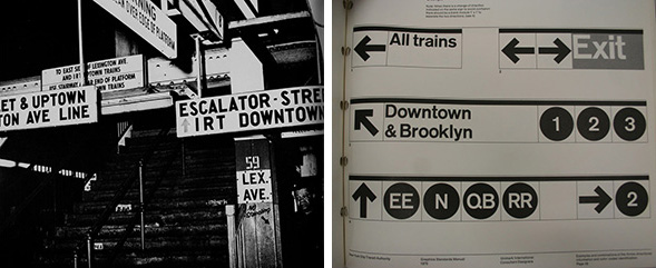
As wayfinding improved, so did ridership. And the NYC subway signage system developed in the 1960's is still in use today--for good reason.
Thanks to designers like Salomon and Vignelli most of the civilized world now recognizes the value of a well-designed sign. A simple icon or pictograph can transcend language and cultural boundaries. Clear, bold typography can cut straight through the noise of a busy city street. And the right color combination can speak volumes for a brand and the quality of its product.
In my humble opinion, redesigning the current bus stop signs would be the single biggest improvement RTS could make for its customers...
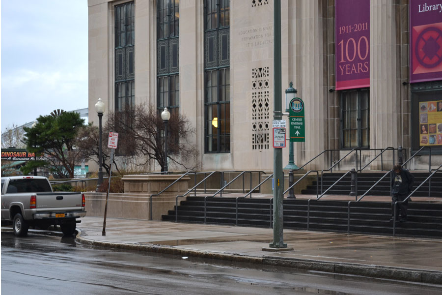
Just how often do you notice these signs while you're walking down the street? How about when you're zipping down the street in your car? Never. That's because this RTS sign is as eye-catching as a No Parking sign. It's the exact same size and color, and often times it's sharing a pole with two or three other signs. That's a problem.
A bus stop sign should be treated more like an informational sign in an airport or subway. It should stand apart from all other signage. It should say "HEY! LOOK AT ME... I'M PART OF A TRANSIT SYSTEM AND YOU CAN USE ME!" And it should be clear and easy to decipher by anyone--especially someone who may be using it for the first time.
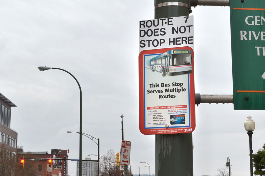
The RTS sign shown above is in front of the Central Library on South Ave. At least 14 different routes stop here. But the only thing this sign tells me is that Route 7 does not stop here. Why doesn't it mention the buses that actually DO? Well, for one thing the sign is too small. But that's just not acceptable.
I believe RTS could gain a substantial number of riders simply by redesigning this sign. And I'm not afraid to donate some free design services to get us there. Here's my proposed redesign...
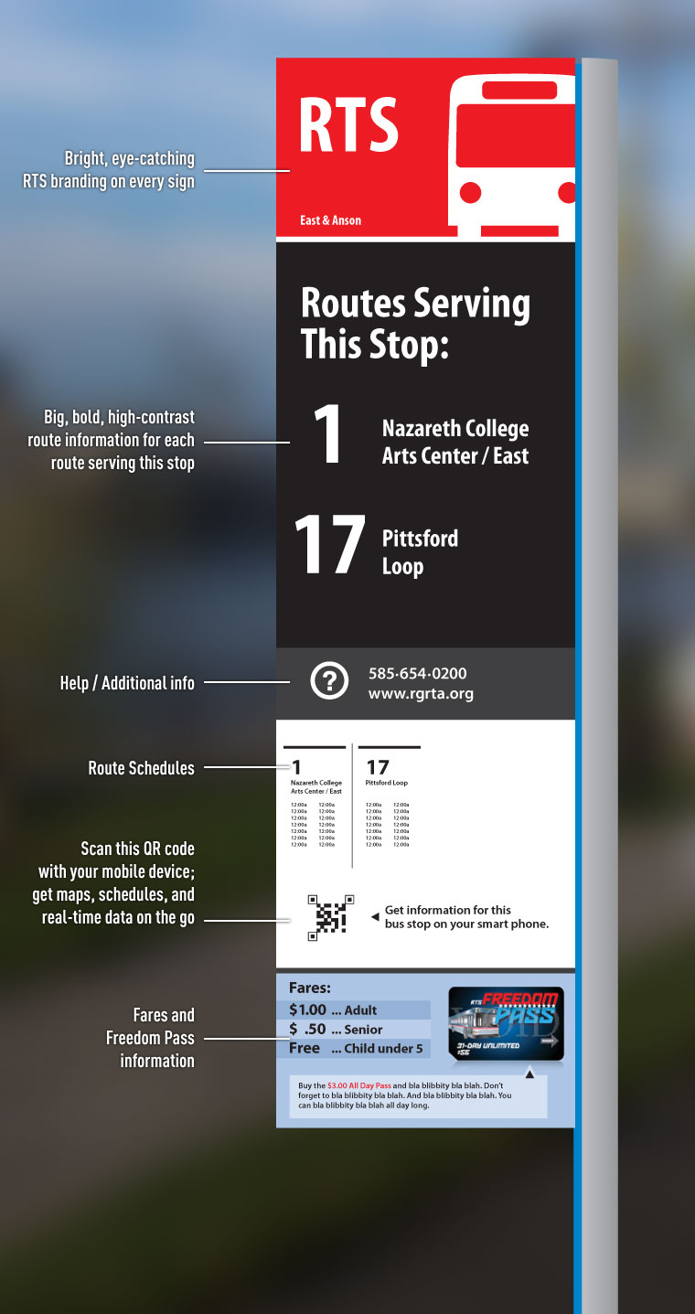
- Bright and bold. There's no mistaking this sign for a No Parking sign.
- Very clean and professional looking RTS branding at the top of every sign. Indicative of a high-quality transit system.
- All routes serving this stop would be clearly marked with large, high-contrast type.
- A phone number and web URL on every sign in case you need additional info or customer service.
- Route schedules for this stop--right on the sign where you need it.
- Have a smart-phone? Scan the QR code and get a route map, schedule, and realtime bus location data so you can take this important information with you.
- And finally, fare information. Those are actual prices by the way... $1.00!
Also, this signage system would be modular so that each sign could be tailored to the specific bus stop. A bus stop served only by a single route would not require all the same information as a sign located in the downtown core where several routes converge. Regardless, all signs should look like they're part of the same unified system (below).
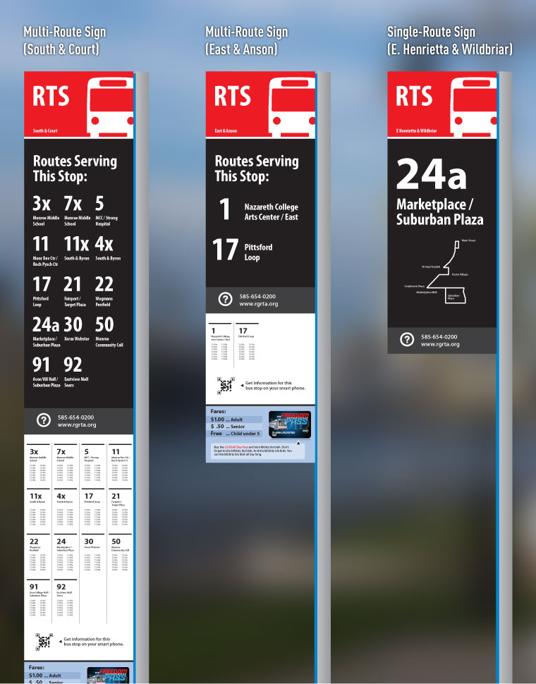
Now before I go to RGRTA with these designs, I need to hear what you think. If you use RTS on a regular basis I need to hear from you. Would a redesign be useful to you? Do these new designs do the trick; or is there something I've left out?
If you've never used RTS before, I REALLY need to hear from you. Would these new signs give you that little extra boost you'd need to jump on a bus next time you head out to the park or grocery store?
Don't hold back. Leave a comment .

