This article was scraped from Rochester Subway. This is a blog about Rochester history and urbanism has not been published since 2017. The current owners are now publishing link spam which made me want to preserve this history.. The original article was published June 27, 2013 and can be found here.

Can you believe it's been two years since I tried to redesign Rochester's bus stop signs ? Everyone seemed to agree that a makeover was in order - even the folks at RTS who were nice enough to meet with me. But a year later there had been no serious progress on that front. At which point I turned my attention to something else I thought I could improve on; the fare cards. This time I was able to make some real progress...

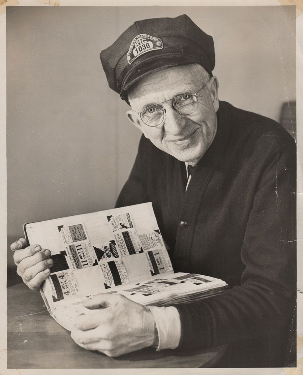
The old bus pass (shown above) fit nicely inside my wallet, and when it's time to get on the bus it always seemed to work ok. But let's face it, aesthetically, Rochester (the "image city") can do better. George Washington is tired and deserves some rest.
Long story short, I looked at examples from various cities...
( NYC

, Chicago


, and others
)
I swiped the best of the best. And this is where we arrived...

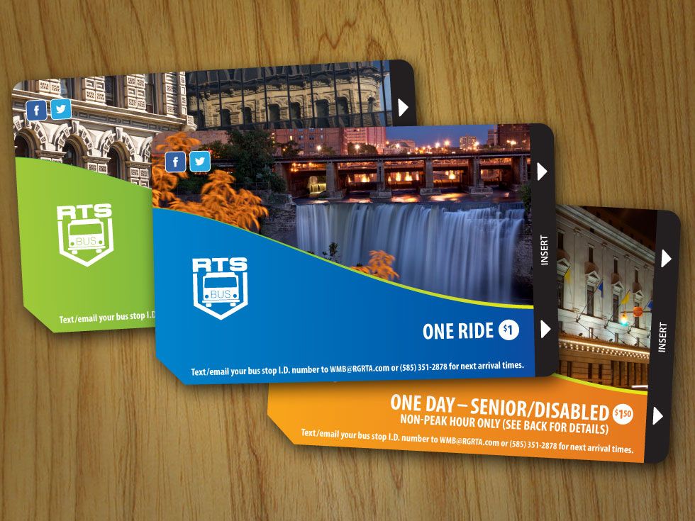
The essential elements I kept were:
1. the card value
2. directional arrow (so riders know which way to stick it in the fare box)
3. the RTS brand/logo
Oh, and I added a line of instructions for the real-time bus tracking info at the bottom.
But if you ask me, the most crucial element missing from the old cards was Rochester itself. The old cards could easily belong to Anytown USA. So for that extra dash of Rochester, I turned to my good friend Rick U. of RocPX.com
. Rick's photos of Rochester's Four Corners, High Falls at night, and the Eastman Theater, remind transit riders why this is such a great place to live. And out-of-town visitors (who arrive without a car) will know they are in a world-class city - that is, a city that values its transit riding population.
RTS agreed that this design is a better reflection of our town, and the service they provide. The cards are being printed as we speak and will be rolled out very soon.
If we can't have a better bus stop sign , and we still can't use our credit cards at the fare box
, at least we have a respectable looking fare card. Go Rochester! Baby steps.
Let me know what you think (love or hate) in the comments below.
PS - I tried to get rid of the Facebook and Twitter icons, but RTS wasn't having it. So I conceded on those.